Colour Your Mood
Posted: February 24, 2012 Filed under: Uncategorized | Tags: colour, interior design, mood Leave a commentColour has a profound effect on human behaviour and it is better understood now than at any time in history.
We have all heard of “seeing red”, “feeling blue” and “green with envy”- but is there real meaning behind colour theory?
There are four psychological primary colours – red, blue, yellow and green. They relate respectively to the body, the mind, the emotions and the essential balance between these three.
BLUE

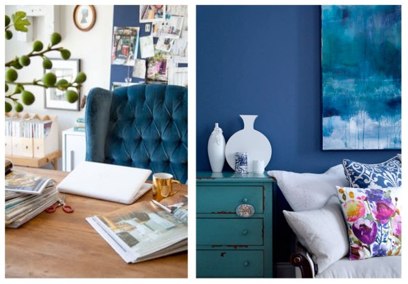
Research has shown that blue is the worlds favorite colour. Blue affects us mentally rather than physically. It is peaceful, tranquil and soothing. Blue causes the body to produce calming chemicals. It’s downside is that it is a cool colour and can be depressing. Fashion consultants recommend wearing blue to job interviews because it symbolizes loyalty. People are more productive in blue rooms.
Use blue in the following ways:
@home: Office or study or yoga/meditation room: Mid-to-dark blues are soothing and encourage clear thought and concentration. Accent with yellow for clear, logical thinking or pink for stress reduction.
@work: Use blue in company logos and within spaces of; Cleaning services, Temp/recruitment agencies, Healing business and Beauty salon.
RED

Being the longest wavelength, red is a very powerful colour. The most emotionally intense color, red stimulates a faster heartbeat and breathing. It grabs our attention first and raises a rooms energy level. It is also the color of love. The effects are physical and stimulating. Red clothing can appear heavier, and isn’t the best choice for when you are trying to negotiate. In design, red is usually used as an accent. Designers say that red furniture should be perfect since it will attract attention in a space.
Use Red in the following ways:
@home: Workout area: Red boosts energy, vitality and physical endurance. Too much can make you feel irritable, impatient or uncomfortable, so combine small amounts with neutrals such as cream or beige. In the living room or dining room, red draws people together and stimulates conversation. In an entryway, it creates a strong first impression.
@work: Use red in company logos and within spaces of; Creative studios, restaurants, cafes, retail and sports related businesses.
YELLOW

The yellow wavelength is relatively long, which activates emotions. This makes it the strongest colour psychologically. Cheerful sunny yellow is an attention getter. Yellow captures the joy of sunshine and communicates happiness. Generally considered optimistic and a friendly color, but too much can cause fear and anxiety. People lose their tempers more often in yellow rooms, and babies will cry more. It is the most difficult color for the eye to take in, so it can be overpowering if overused. Yellow also enhances concentration, hence its use for legal pads. It also speeds the metabolism.
Use Yellow in the following ways:
@home: Dining room and Kitchen: Yellow stimulates digestion, metabolism, detoxification and appetite. It can be used in many shades such as rust, amber, earthy colours such as nut-brown, golden yellow, peach. It’s perfect for kitchens, dining rooms, and bathrooms, where happy color is energizing and uplifting. In halls, entries, and small spaces, yellow can feel expansive and welcoming.
@work: Use yellow in company logos and within spaces of; Construction Companies, hospitality and agriculture related business.
GREEN

Green stands for balance, harmony, refreshment and of course the natural environment. It is extremely restful. Currently the most popular decorating color. People waiting to appear on TV sit in “green rooms” to relax. Hospitals often use green because it relaxes patients.
Use Green in the following ways:
@home: Combining the refreshing quality of blue and the cheerfulness of yellow, green is suited to almost any room in the house. In a kitchen, a sage or medium green cools things down; in a family room or living room, it encourages unwinding but has enough warmth to promote comfort and togetherness. In a bedroom, it’s relaxing and pleasant. Green represents nature in our home and is a great way to bring in actual plants that have lush green foliage.
@work: Use Green in company logos and within spaces of; Day Care Center, schools, travel agencies, florist, hospitals, medical practice.
All in all when using colour, its worth thinking about what it will be predominantly used for, and how much time will be spent looking at it. Using common sense seems to always prevail- A bedroom needs to be a restful place but also warm and cosy, a living room should be warm and welcoming.
Go forth and colour your world!